Jess Haines is one of my favorite new authors. Her first book came out a few months ago and it was FANTASTIC.
Here is the cover of her first book:
How frigging rad is that??
Here is the cover for the second book:

AUGH!!
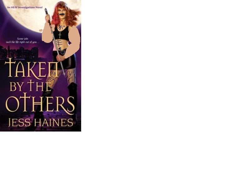
Where did Shiarra go?? Why is she wearing a hooker-suit? Did she get a ton of cosmetic surgery all of a sudden? (Is she secretly a MAN, MAN???)
Here is what I see when I look at this:

Can we fix this somehow???
Edit: Okay, I've cooled down a little bit since first seeing this. Here's the thing: I think the color scheme is quite good, and the cover is eye-catching. If I was a new buyer, who had NEVER EVER read the first book, and I was looking for some nice UF smut, I would probably look at the back cover of this book. BUT. If I had read the first book, or didn't want a main character who was - for lack of a better word - gettin' some action (hurr hurr hurr)... I wouldn't TOUCH this. Honestly, the cover could be saved by a) fixing her man-jaw, and b) giving the woman some clothes.
We now return you to your regular programming.
No comments:
Post a Comment